Mikko Thewes (case),
Stephanie Connor (ux)
“It's very easy to be different, but very difficult to be better" is a famous quote of Sir Jonathan Ive. And indeed looking to pens and especially to digital styli there are a lot of different designs, all trying to be outstanding and unique and somewhat different. But only a few are really good designed, consequent to the detail well-executed objects with aesthetic quality integral to its usefulness to affect our person and our well-being when using them every day.
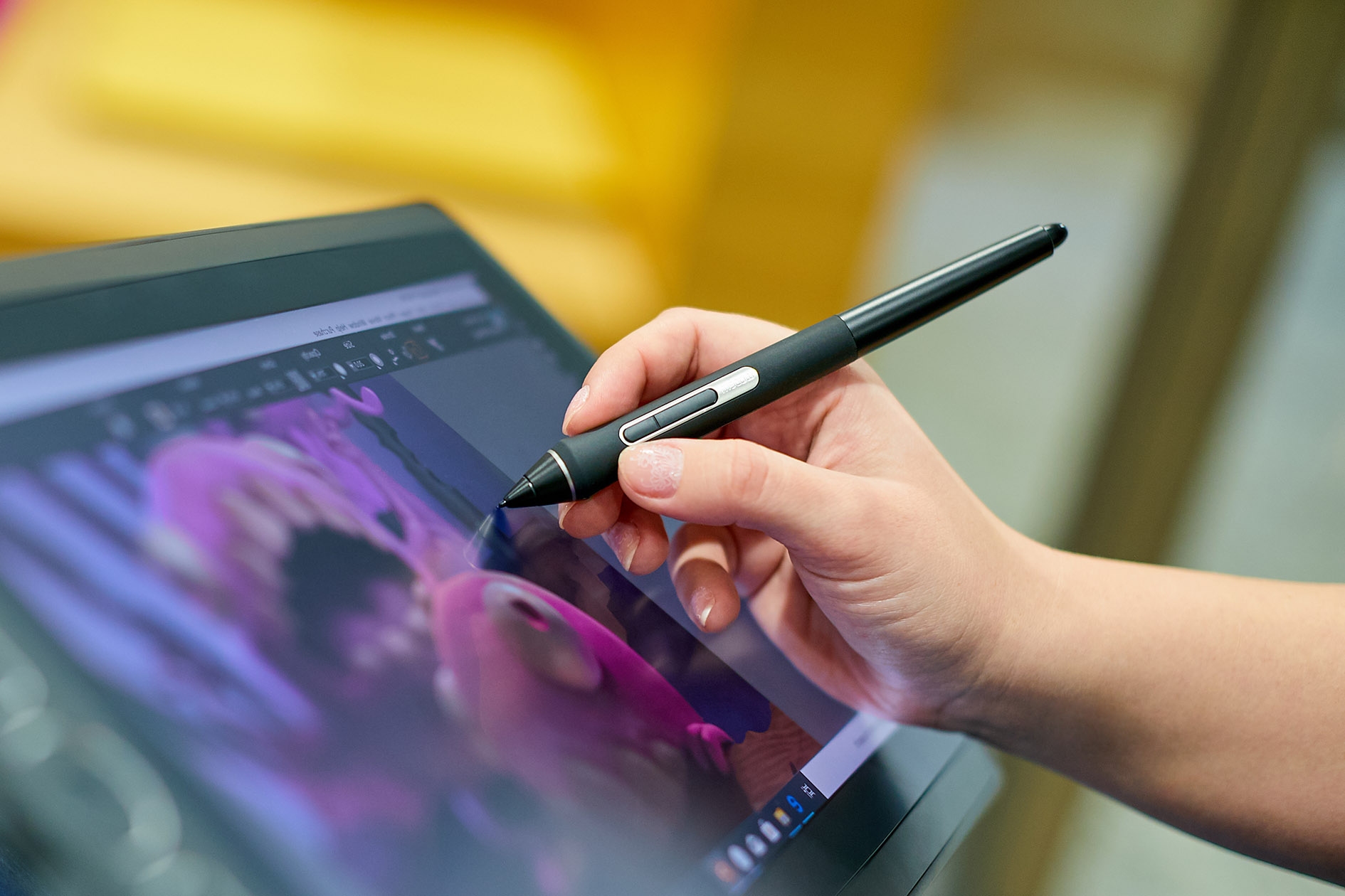
The Wacom ProPen and it's family maybe belongs to this group, but at least these are proven to be the perfect digital tools for long and exhausting working days of creative professionals. And their shape and appearance finally stands iconic for the best in class digital pen experience provided by Wacom well known all around the world.
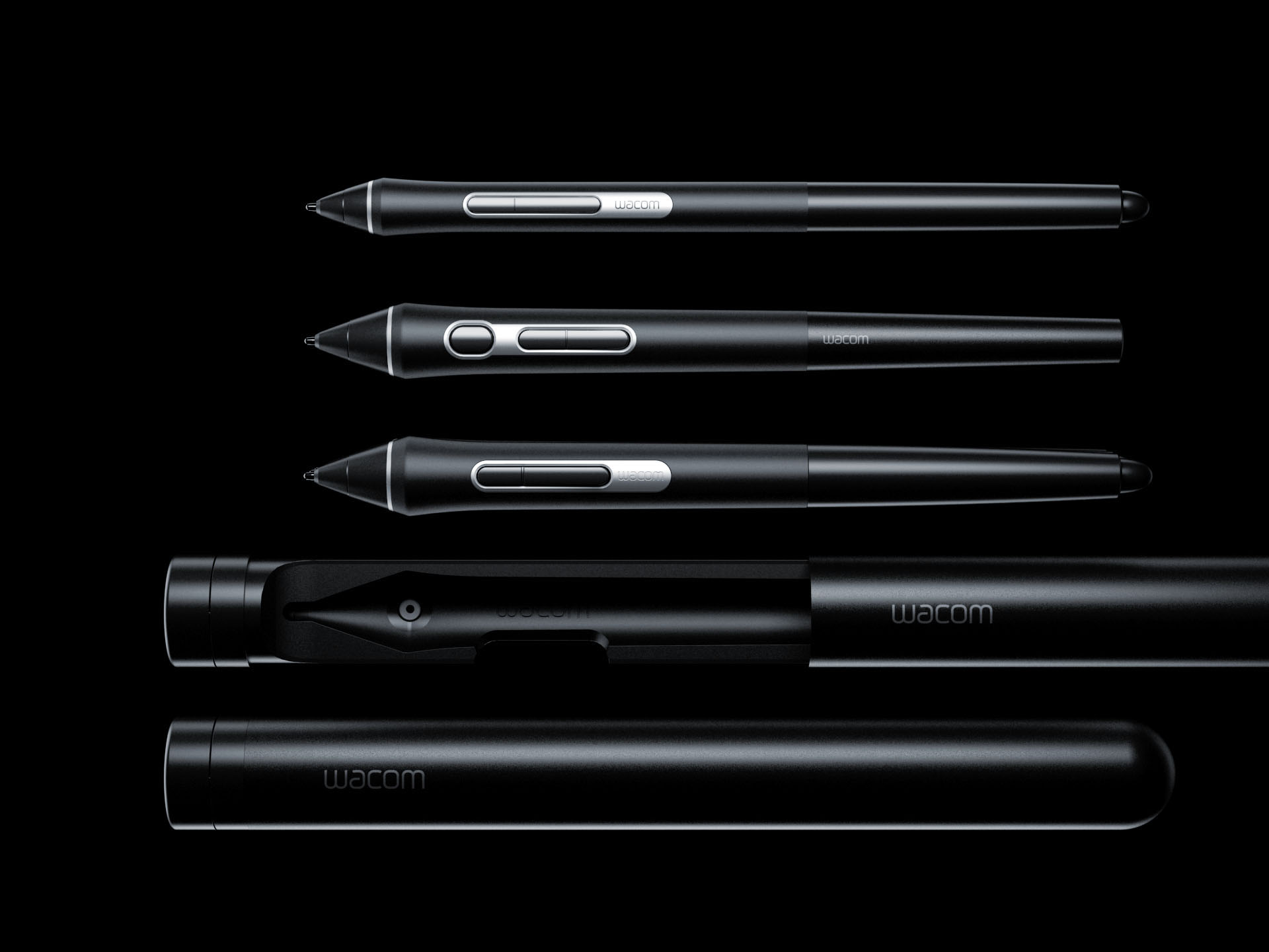
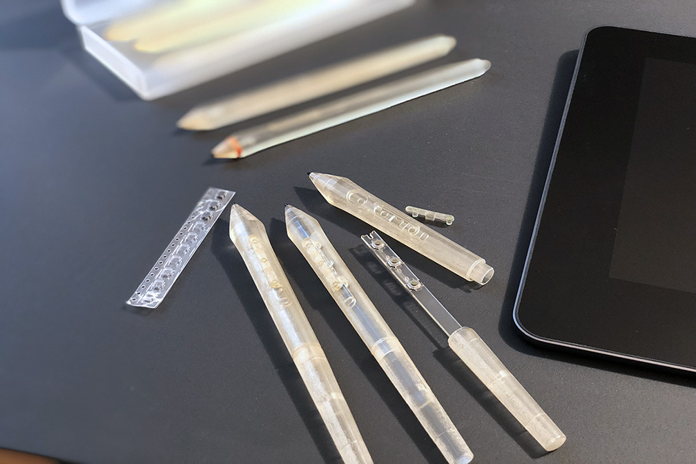
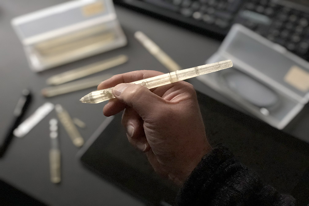
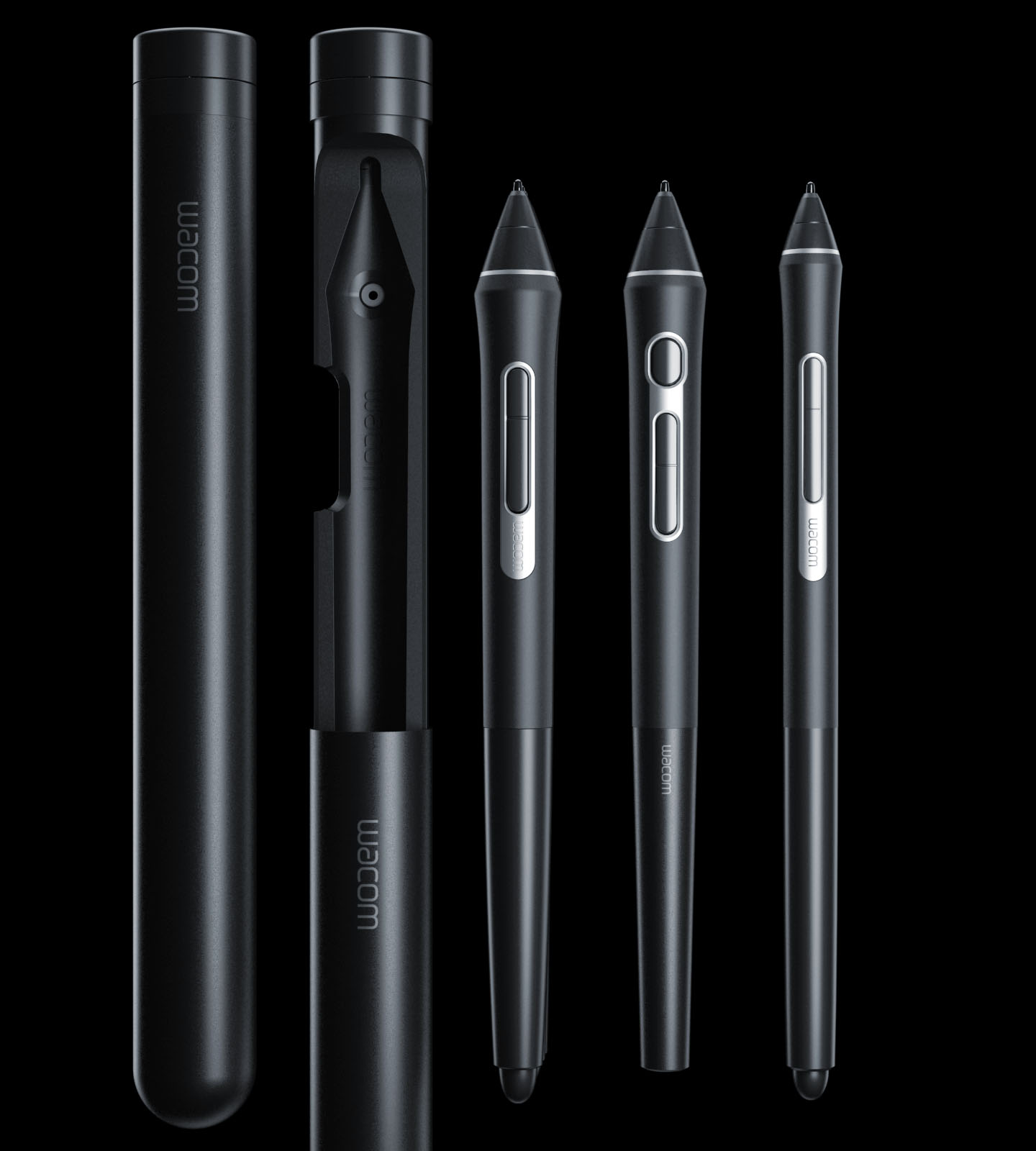
Shape, diameter, length and the position of the buttons has been tested and adjusted iterativly multiple times fo finally find the best match for a lot of different artists and also many different styles to work with a pen. At the end 3 different diameters with 3 different arrangements of the buttons with eraser or without made their way to production.
Small details extend the usefulness of the ProPens, e.g. changable color rings to provide a subtle personalisation and a functional differentiation in studios with more digital artists. Carefully choosen materials and finishes – hard coating for the housing, soft rubber for the grip area and fine anodized aluminum trim – give the ProPens the appropriate premium appearance according to their outstanding performance.
iF award 2018 (ProPen 3D), iF award 2019 (ProPen slim)
pen tube case design
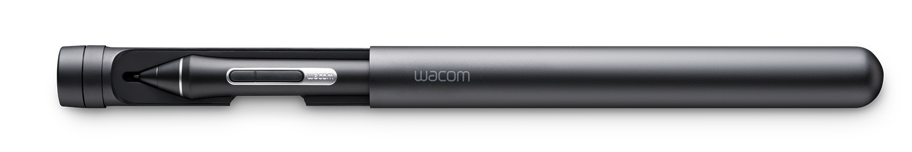
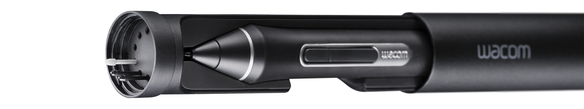
For the ProPen family we designed a case tailored to match all different pen shapes and diameters with one design. The smart anodized aluminum tube with a soft silicone inlay protects the pen perfectly when carrying it around. The pen tube slides easily over the tray and close with a click.
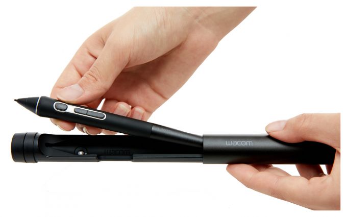
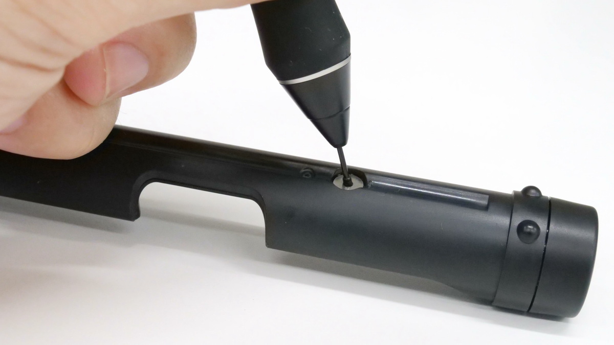
Additionally the case contains a compartment to store different types of pen nibs or spare nibs with the tool for easy nib change integrated in the pen compartment. And no worries. Although it's perfectly round the pen tube will not roll down the desk. Two bumps in the housing make sure the pen tube case stays always there where the artist has placed it.
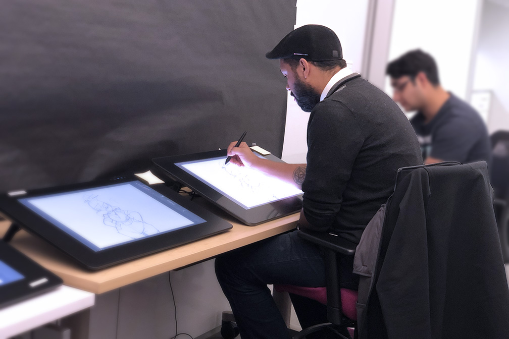
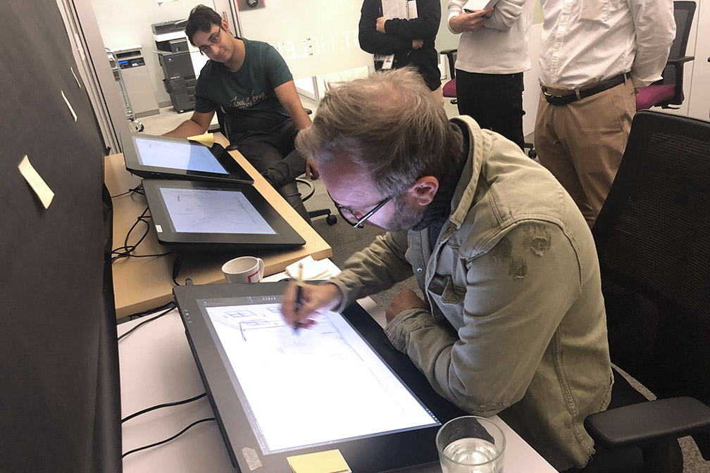
user research and testing
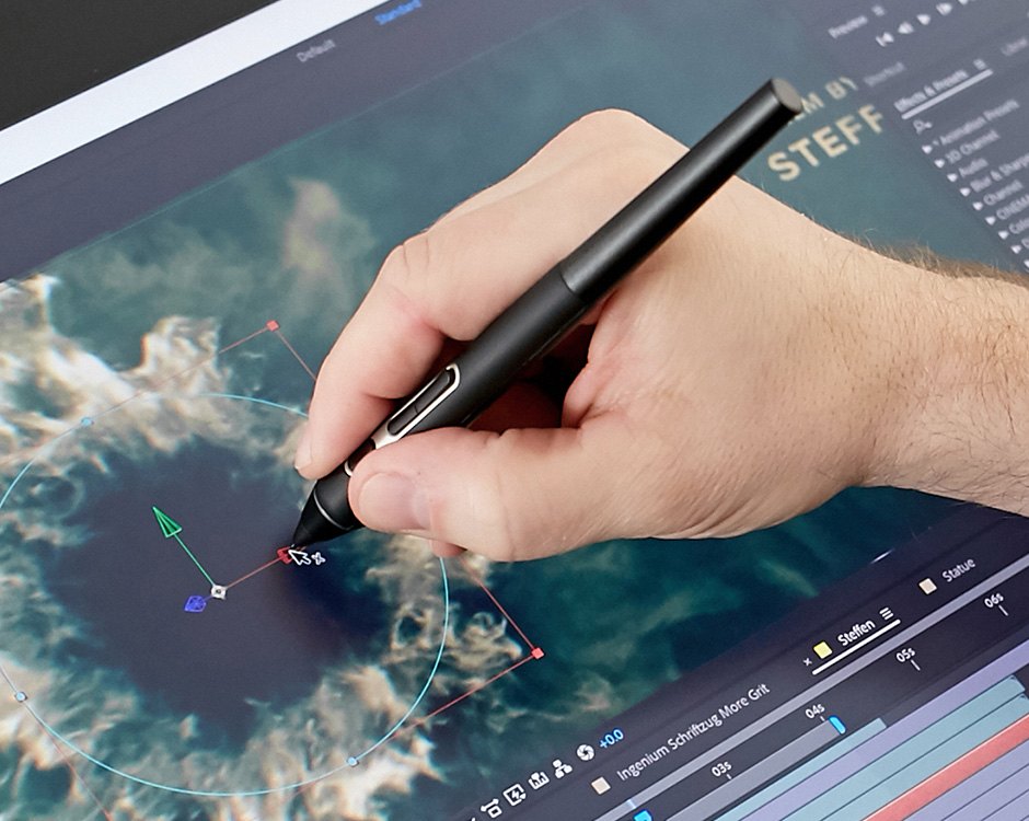
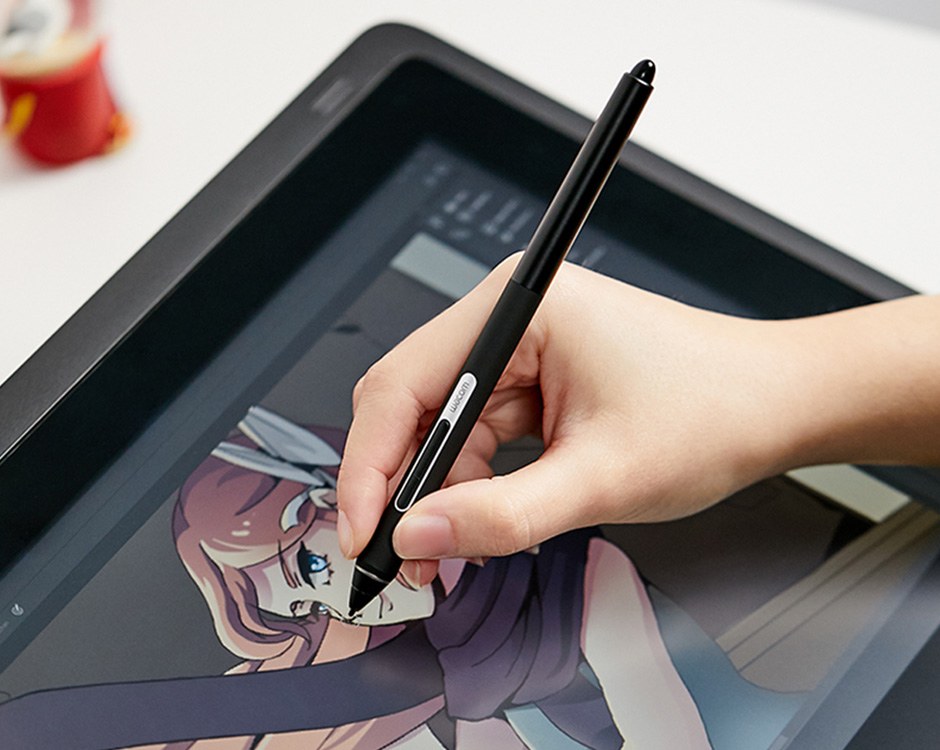
Every hand is different and everyone holds a pen in a different way for the best stroke. To learn about this pen design needs to be researched, tested and verified multiple times. So we did with the ProPen family. Beside ergonomic testing of shape diameters, weight etc. also the behavior on the "paper", the display, is important to find the right balance of friction and activation force for a drawing feeling as natural as possible.
ProPen family
ProPen 2 is the standard pen shipped with all creative displays and opaque tablets. With the largest diameter it is the proven most ergonomic and relaxing dimension and so the best choice as the working horse for creative professionals. Two side switches and an eraser on the rear side provide the standard functionality.
ProPen 3D has a third button for navigation in 3D space. A slightly smaller diameter and different position of the 3 switches enable an enhanced ergonomic balancing. the rear bead blasted aluminum housing and side switch bezel underline the premium position of the pen.
ProPen slim has the smallest diameter. Since every hand is different and everybody holds a pen in a different way some people prefer the smaller dimension. With its fine and accurate details the ProPen slim is a beautiful tool for creating great designs.
cmf & design language for the best in class pen
Premium quality of the ProPen family needed cmf and design language to provide superior ergonomics and to express the best pen performance. The grip has to have some "tooth" to hold the pen safely and some softness to reduce stress to the fingers on long working days. And moreover the chosen silicone material needs to be resistant against sweat and oil but also it may not collect dust or become sticky. Using metal to underline the accuracy and the performance of the pen has been the initial idea but metal shields the electro magnetic resonance signal transmission between the pen and the device. So only the top product ProPen 3D got an aluminum rear barrel. But to give all pens the premium touch the bezel around the side switches became CNC milled and bead blasted aluminum which also helped to design the bezel accurate, thin and elegant but sturdy enough to be removed for changing the silicone sleeve.
maintaining cmf & design language towards mp
Premium quality is not only a question of the design concept or the choosen materials and processes but a question of how a manufacturable quality can be achieved keeping all the fine details of the initial design. Close tolerances with high yield rates but at reasonable cost is the goal. This needed multiple rounds of enhancements, tough negotiating with the Taiwanese and Chinese manufacturers and close collaboration with the inhouse engineering in Japan.
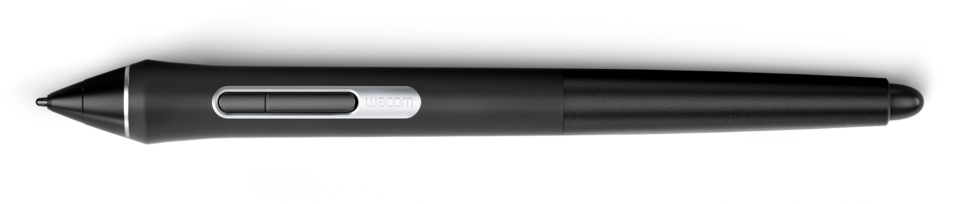
Image credits: Wacom, Volker Huebner